Buttons Were for Humans
The next design problem isn’t the interface. It’s the grammar.
This week I got pulled into a Slack thread about a UX question. The kind that sounds small but somehow isn’t. A user has to accomplish something, and on that journey, there are two paths they can take. The debate: do you show a pop-up upfront so they choose which path, or do you let them go and then surface a switch at the end? Simple enough. Except the thread hit 60 messages. Data. Screenshots. Strong opinions held with great confidence. Back and forth, back and forth.
Midway through, I got a little irritated. Not at anyone specifically, more at the situation.
Here’s the thing. I’ve built products for consumers and I’ve built products for businesses. In B2C, you obsess over this stuff and you should. You’re designing for someone who didn’t ask to be there, who has three other tabs open, who will bounce the second something feels off. Every friction point costs you a real human decision to stay or leave. So yes: run the test, read the data, sweat the milliseconds.
But SaaS is different. Whoever is using your business tool showed up because their company bought it. They will learn it. They’ll complain about it in a Slack thread of their own, then figure it out. So you have two levers: copy the conventions of whatever tool they’re switching from, close enough that the learning curve is shallow, or default to speed, meaning you get out of the way and let them do the thing they came to do. That’s mostly it. You don’t need 60 messages.
But that irritation isn’t why I’m writing this. What came after is.
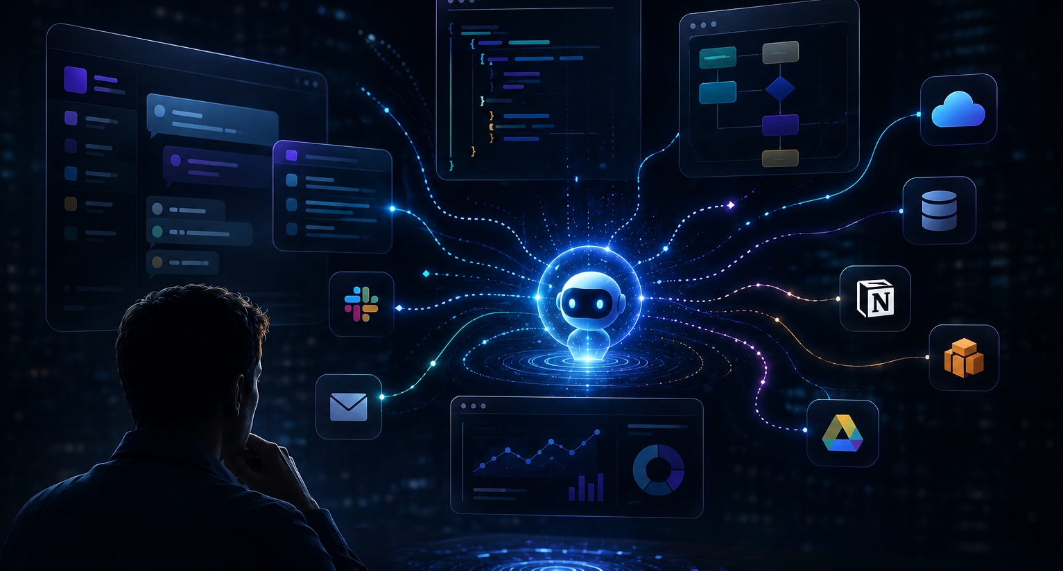
Because somewhere in that thread I started wondering: if agents are increasingly the ones navigating the software we build, who are we designing that pop-up for?
If you’ve been paying attention, you probably already see where this is going.
Watching agents work
I’ve spent the last couple of months running AI agents, full assistants. Things that fill out forms, browse the web, buy things, book things, make calls, respond to emails. The real version of the pitch you’ve been hearing for two years. It’s here, it works, and it’s weirder than the demos suggest.
I have three agent instances running on a VM in my home lab: OpenClaw, Hermes Agent, and Boop, a bare-bones framework I’ve forked and am building my own agent on top of. So I’ve been watching these things operate up close, across a lot of different surfaces.
Here’s what I keep noticing: when you give an agent a task, it goes wherever the path of least resistance is. It doesn’t have loyalty to your interface. It doesn’t care about your onboarding flow. It navigates to whichever platform makes it easiest to get the job done, and if yours doesn’t, it finds one that does.
Layer in what’s happening with inference costs. For under five hundred dollars, you’ll soon be able to buy a machine, run an open-source model on it, and have something capable enough to handle real work. Then add the rumors that Apple is rebuilding Siri as an LLM-powered agent shipping in iOS 27. Agent frameworks could be mainstream by end of year.
None of this is speculation at this point. It’s just timeline.
The next design problem
Which means the next design problem isn’t the interface. It’s the grammar.
When a human uses software, there’s a shared understanding: buttons mean affordances, errors mean stop, loading means wait. Agents don’t read that grammar. They read APIs, schemas, and responses. So what does it mean to design software for something that doesn’t experience it?
That’s not rhetorical. Nobody has answered it yet.
The first real question is failure. Human-facing software has decades of work on error states: the empty screen, the sad cloud, the “something went wrong.” Agent-facing software has almost none. And agents fail differently. They don’t stop at the error message. They hallucinate past it, retry into a loop, or silently succeed at the wrong thing. So who designs the moment when an agent screws up? Who owns the recovery surface: the product, the orchestration layer, the human who set the agent loose in the first place?
The second question is broader: power. Agents route to whoever has the best API. That’s not a bug, it’s the logic of automation. If your data is clean, your endpoints are fast, and your docs are machine-readable, agents will use you constantly. If you’re behind a login wall, rate-limited, or just poorly documented, they route around you. This isn’t disruption in the classic sense. It’s more like gravity. It compounds quietly. Incumbents with solid infrastructure get more usage. Smaller players get skipped, not because they’re worse products, but because they’re harder to integrate programmatically.
That’s the concentration problem. And it’s already happening.
What I want to try
As for me, I want to experiment with a SaaS product with no UI. Just an agent. You talk to it in Slack, iMessage, email, wherever you already live, and it does the thing. No dashboard to learn, no nav to memorize, no onboarding flow. The interface is the conversation.
This isn’t just a design choice. It’s a bet on attention. People don’t want more tabs. They want outcomes dropped into the context they’re already in. Zero UI forces you to get ruthlessly clear on what the product actually does, because you can’t hide a weak value prop behind a polished screen. If the agent interaction isn’t useful, there’s nothing else to fall back on.
With an agent-only product, you have to ask yourself: What does a successful exchange look like? What’s the failure state when the agent misunderstands? How do you handle edge cases with no visual affordance to guide the user back?
I don’t have the answers yet, but I think these are the things we need to be experimenting with.
Related Musings
Tavo Is My Test Kitchen
I vibe coded a Restaurant OS in a month. It takes orders on WhatsApp for a delicatessen that does not exist. Its job is to tell me what I don't know, before I write a PRD for a codebase serving 30,000 businesses.
Aug 8, 2026 AIGetting Started with RAG
A practical introduction to retrieval-augmented generation: what it is, why it matters, and how I've been using it.
Feb 15, 2026